Symbiosis
Abstract
My driving force in this project was to create a typeface that explored a personal theme in my life. My studies in graphic design have ignited a passion for typography, and I felt that exploring this would be a great challenge and learning experience. After deciding that, I went through the ideation portion of the project and found myself drawn to relationships. During my time at DePaul I entered my first serious, long-term relationship. While navigating this, I find myself thinking a lot about my own reliance on my partner and how interdependence develops in relationships.
Research
To get some more opinions on this topic, I decided to create a questionnaire to send to some of the people I am closest with. I felt the best way to get more information about reliance and interdependence in relationships was to hear from people that have experienced this personally. When creating the questionnaire, I tried to keep questions open ended so that those responding would be able to elaborate on their current or past relationships in a way that they felt comfortable. I reached out to people that have had a wide range of experiences in their relationships so that I could hear a range of opinions about this topic.
Once looking at this, I refined my idea for my final output. I wanted to design a typeface where the uppercase and lowercase forms could exist as one form, but also independently from each other. I took inspiration from the Rubin Vase, and wanted each letter to have the potential to be seen as either case, or as one form. I felt that this was the perfect way to visually show the exploration into relationships. The way that I view the ideal relationship is that both people in it can exist independently from each other, but when combined can become a cohesive team that supports and strengthens each other’s growth.

Process
After deciding the direction of my project, my goal was to make two typefaces that interacted with each other but also could exist as separate entities. I began some design exploration of this idea, but was struggling to find a way to make the two typefaces feel distinct while also being able to combine in a cohesive way. This was when I was given the suggestion to look into Gestalt psychology and images like the Rubin Vase.
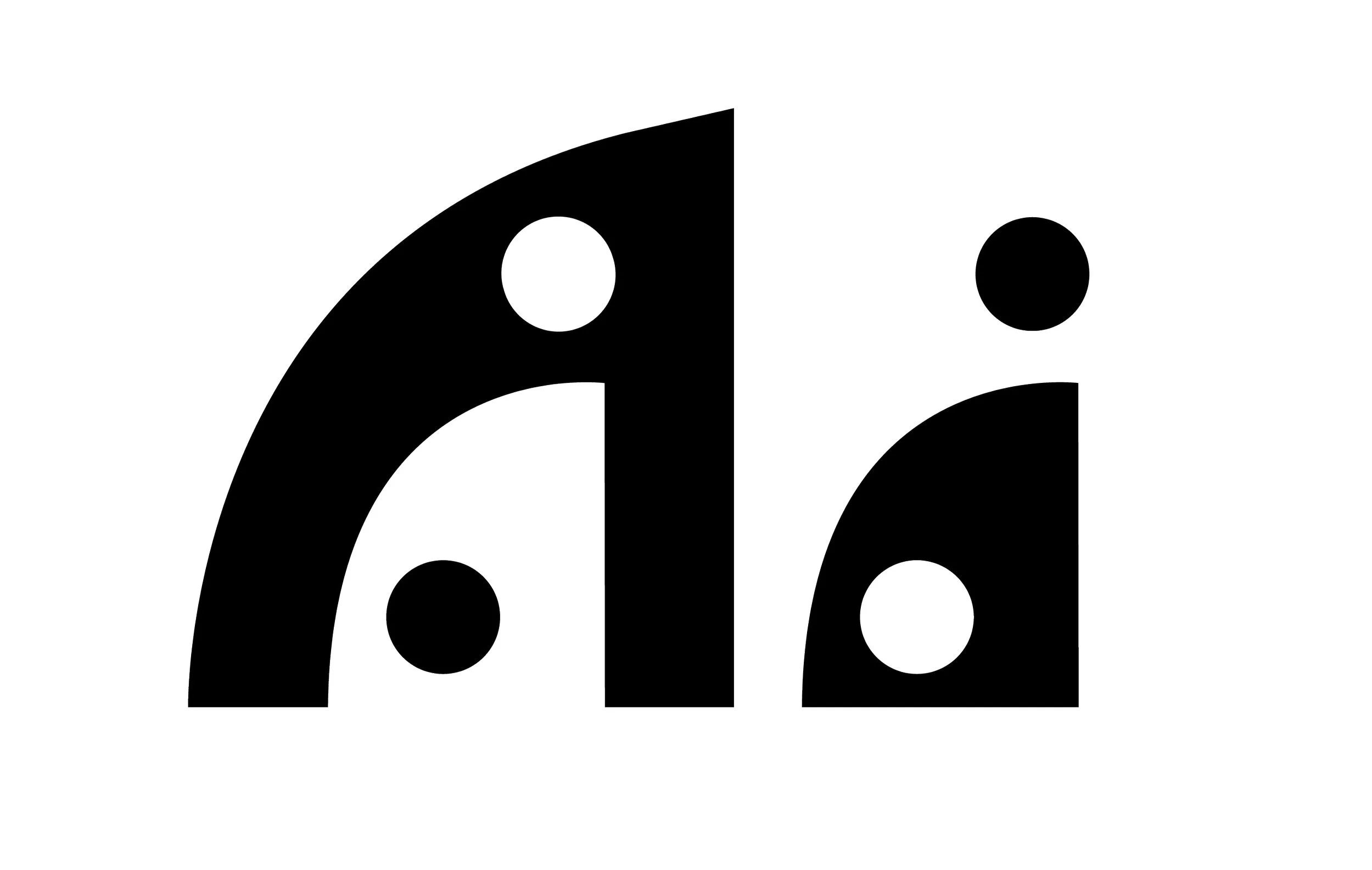

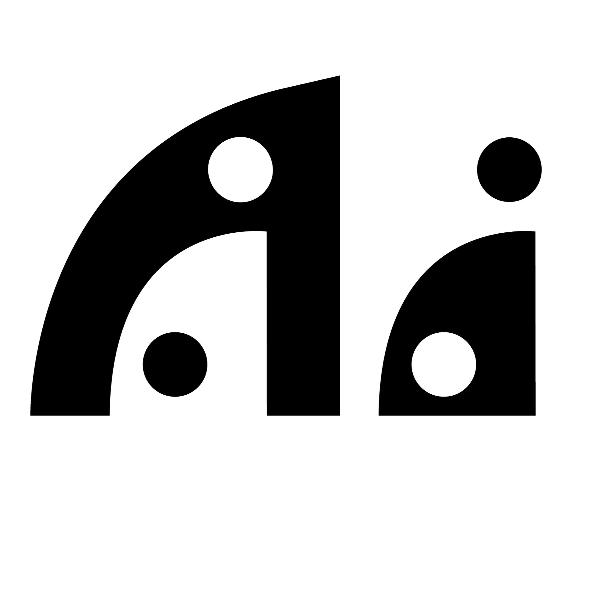
I started with the letter A to see if this idea would be possible. After a few attempts, I figured out a solution that I was happy with and went forward with this idea.
For the letter A, I started by looking at the positive and negative space of the letter and how I could manipulate both to create a lowercase inside the positive space.
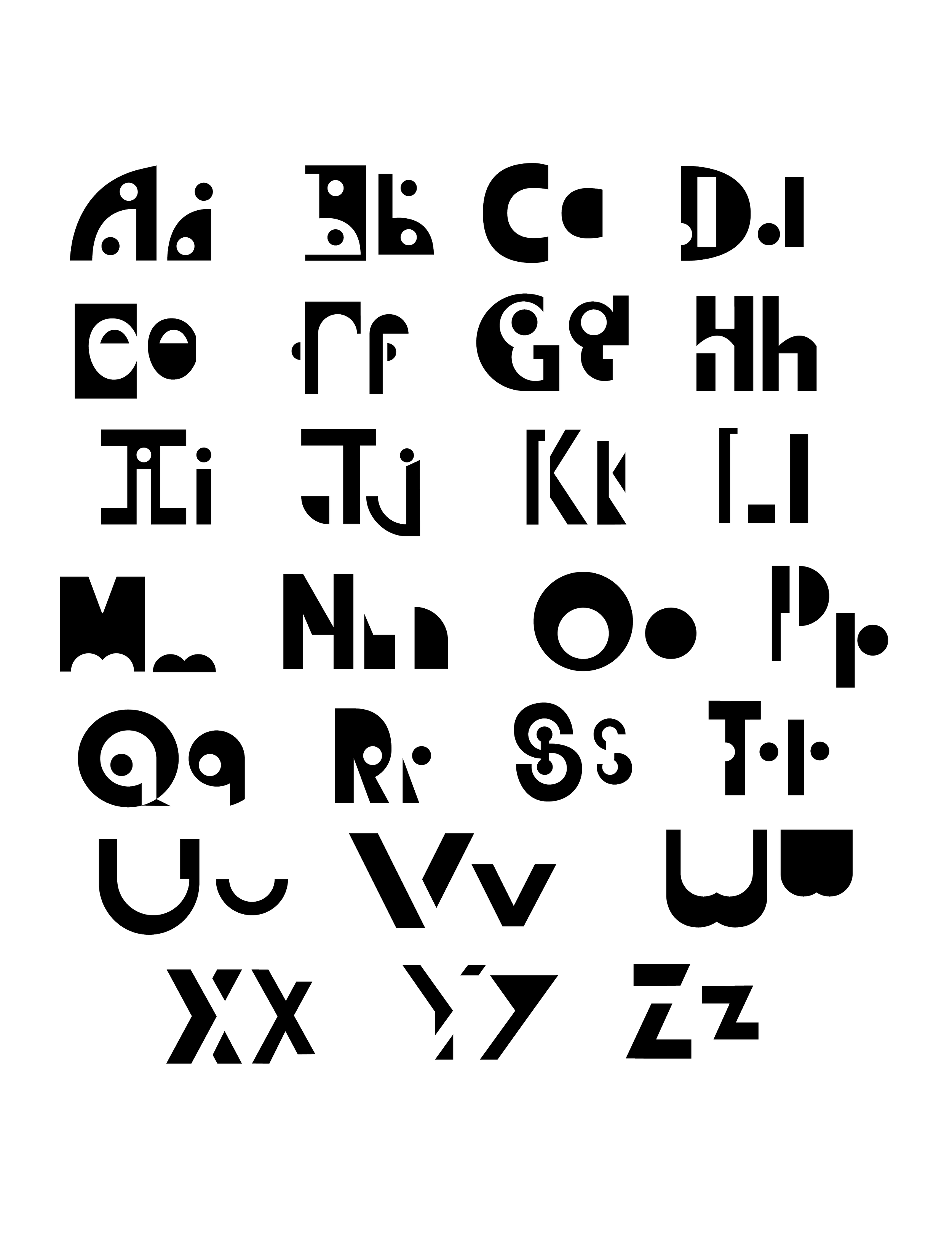
This is the method that I used for most of the letters. I found some letters to be more successful than others. The more “complex” letters, such as A, E, G, and R were easier to solve for because they had more negative space within the letter that could be manipulated.
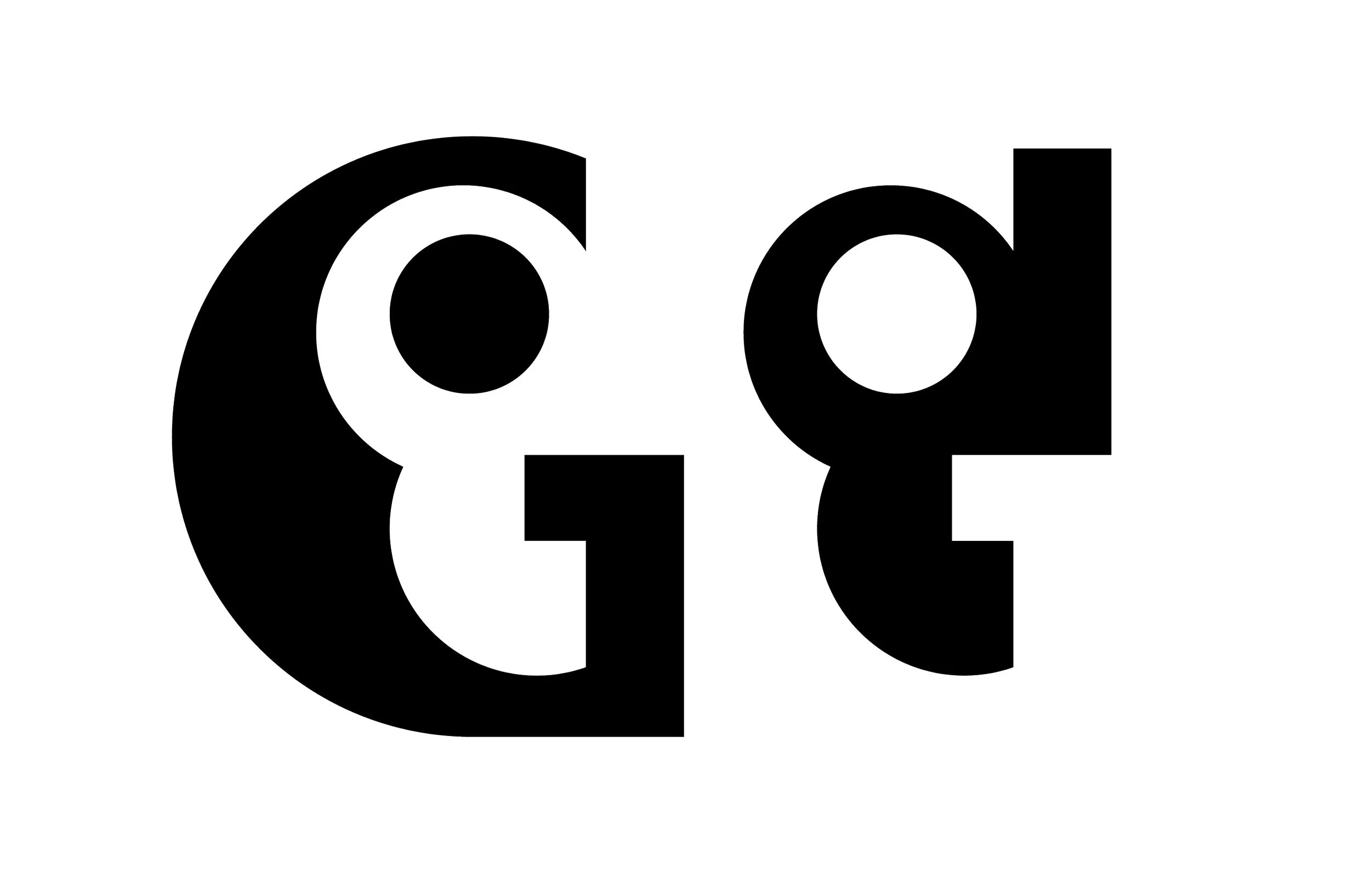

Letters like J, T, and U were more challenging even though they are more simple letter forms because the uppercase forms do not have any negative space to use as a part of the lowercase. To solve for these I found ways to weave the lowercase form into the uppercase form.

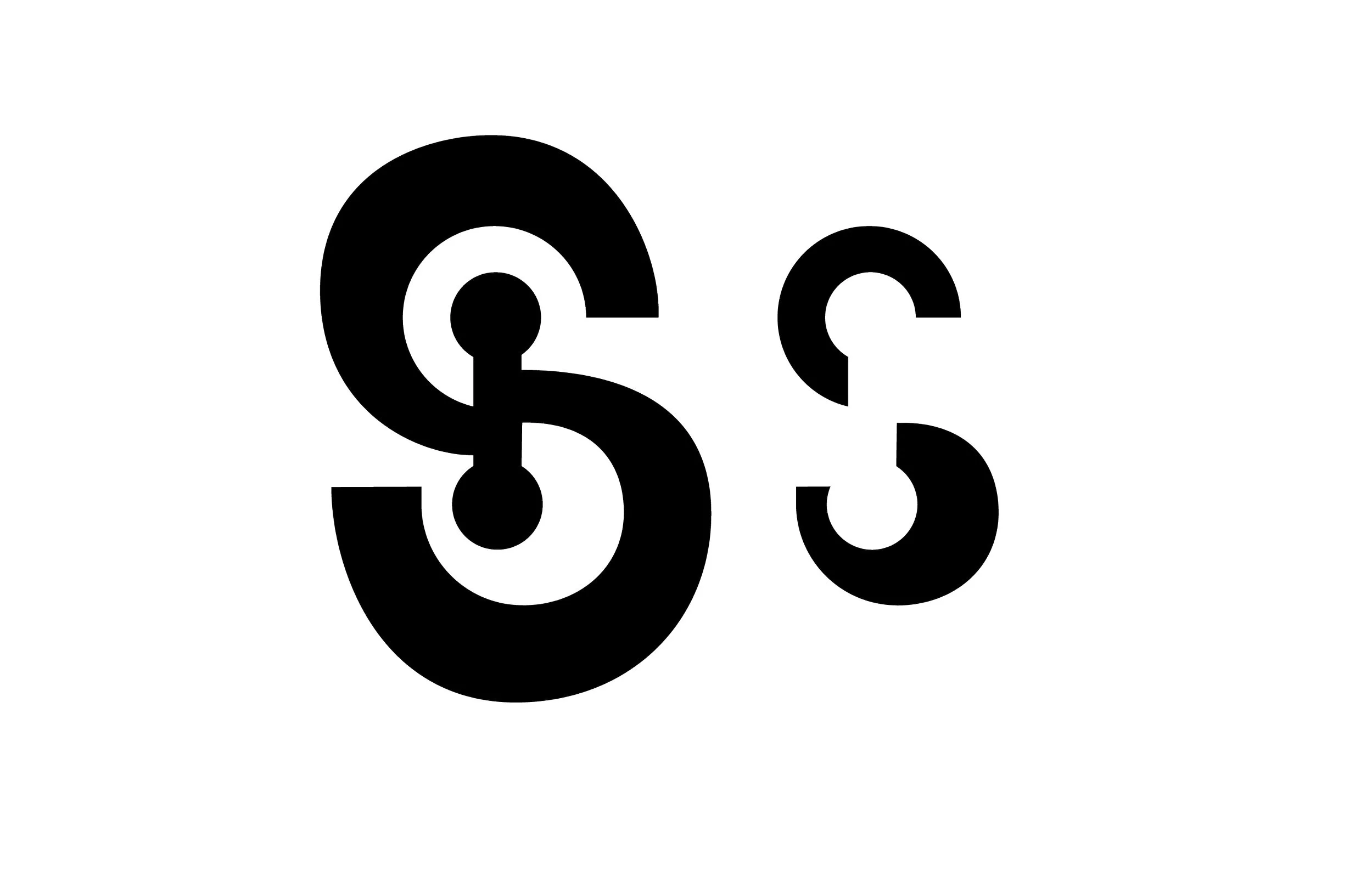
The letter S is notoriously difficult to design, so I struggled the most with this letter. Drawing the letter was a challenge within itself. This typeface is pretty geometric, so I used circles to get the basic form started. When it came to incorporating the lower case, I didn’t feel that using a more simple counter form was the most successful way to create the Rubin’s Vase effect, so I decided to add some extra elements onto the uppercase S to create a more complex counter form and draw the lower case.