
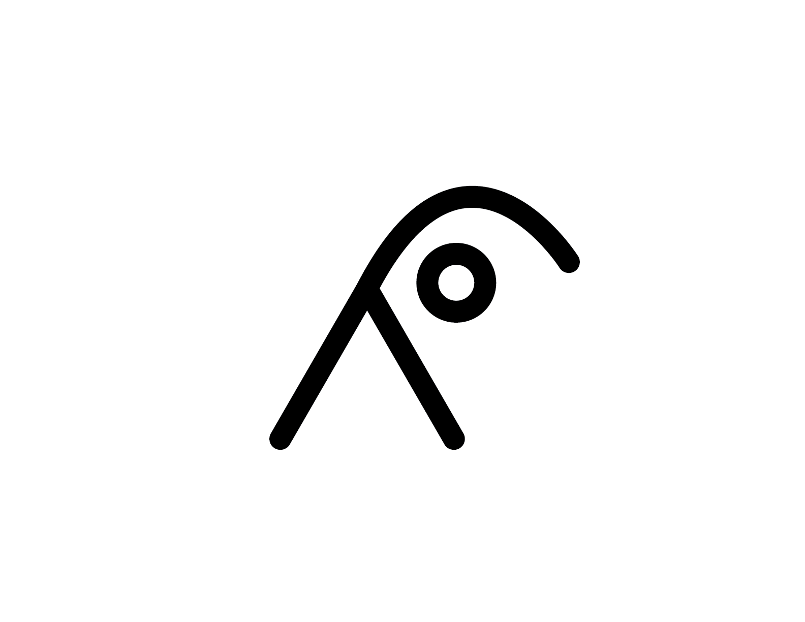

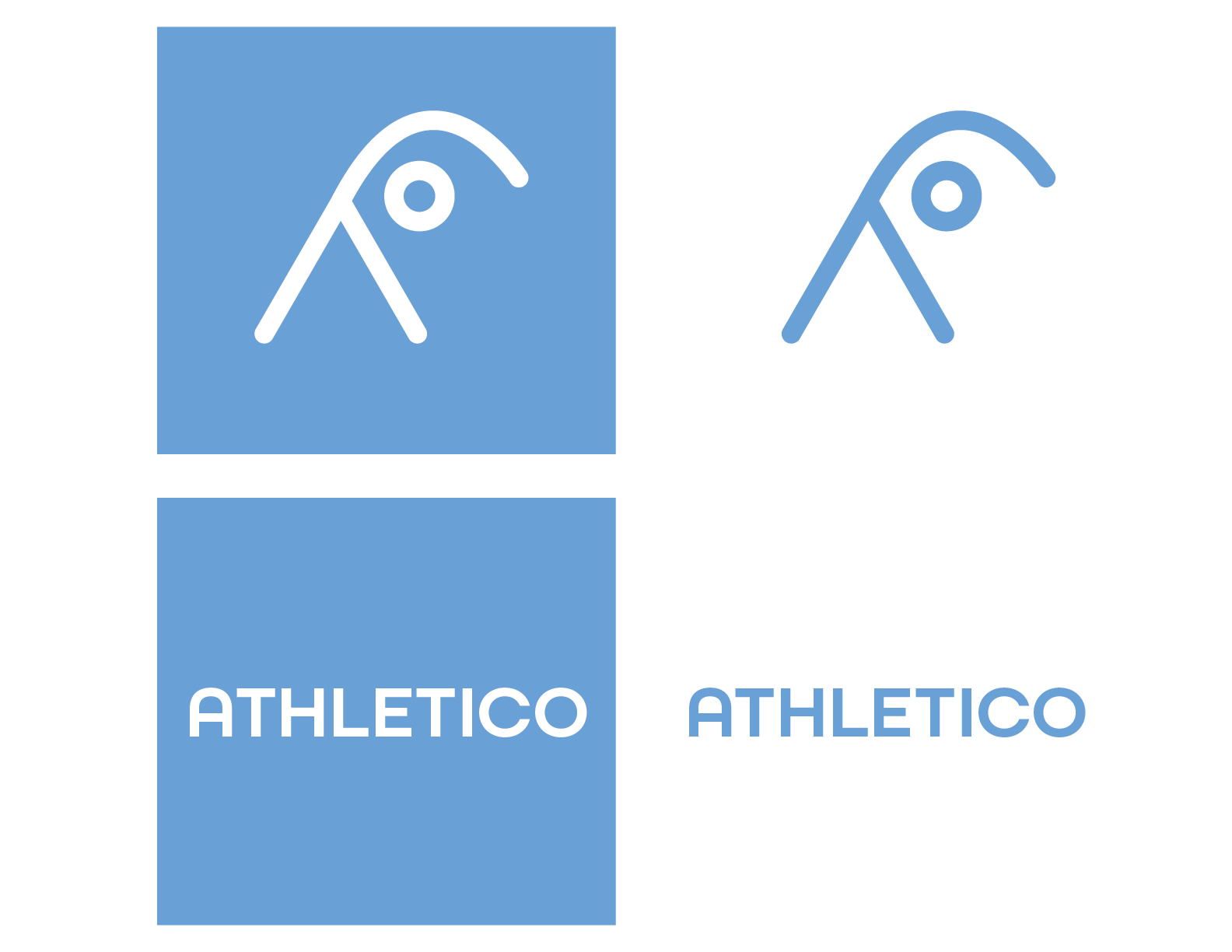
Athletico Physical Therapy
This is a logo designed for Athletico Physical Therapy. For this logo, I wanted to design something that would incorporate the movement that is a part of physical therapy as well as including humanistic elements to give the company a personal and inviting feel. For my final design, I settled on a glyph of the letter "A" that I added on to to create the appearance of a person stretching.
Blick Art Materials
This logo was designed for Blick Art Materials. When designing this logo, I was inspired to include some brush-like lines, but I also wanted to keep the form geometric. In my initial sketches, I explored many different iterations, but I ended up going in this direction because I felt it had the combination of organic and geometric that I was looking for.
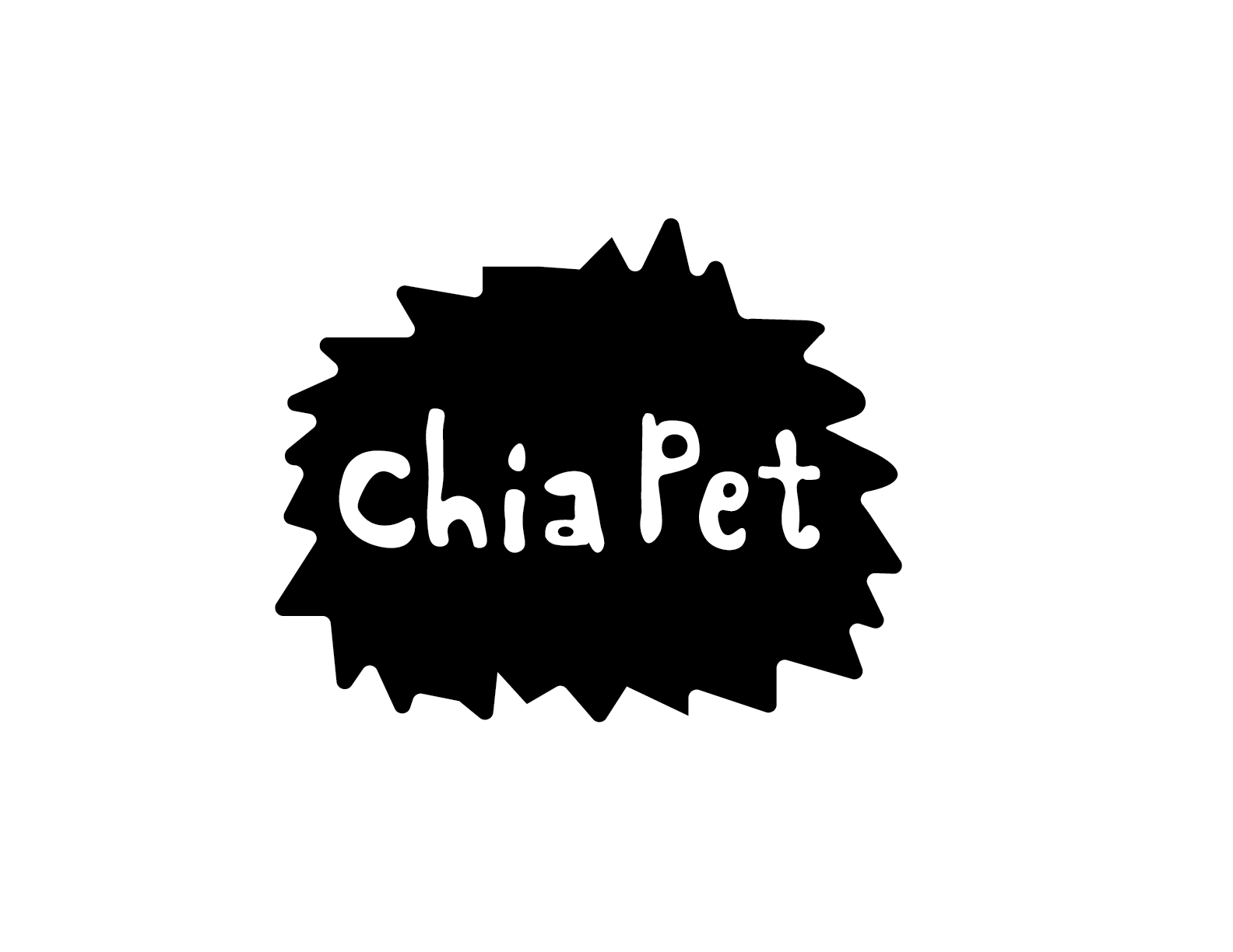
Chia Pet
This logo was designed for Chia Pet. For this logo, I really wanted to create something with a fun and youthful feel. I also wanted to include some organic forms to mimic the chia seeds growing. To achieve this look I created the black shape and then drew the type by hand. Since this brand has such fun products, I wanted to make sure that the shape and type didn't look too polished and had a hand-drawn feeling to them.